16 Beautiful Print Ads that Let Imagery Speak
It’s been suggested that in an average day, a person is subject to upwards of 5,000 advertising messages. Realistically, that amount depends a lot on lifestyle habits, but the point remains – advertisements are everywhere and plentiful. Most of us will never recall seeing thousands of ads in a day, even if the exposure was there. Our amazing brains have developed a filtration system to weed out the clutter, which means only a handful of ads might breakthrough that filter each day and truly reach its audience.
There are many ways advertising is evolving in attempt to catch the eye of the viewer in this over-saturated marketplace. Personally, I am a huge fan of the tried and true, traditional print advertisements. Adobe’s “State of Online Advertising” report found that only 8% of people paid attention to online ads, while 26% paid attention to print ads in newspapers and magazines. TV ads captured a 22% attention rate, while radio ads captured 16%.
One creative way to grab the attention of that oh-so-crucial 26% that notice print ads is by implementing the sweet, simple, and to-the-point solutions – the meaningful and stunning, yet text-minimal. The advertisements featured in this edition of Creative Juice are a few (of so many) great solutions that let imagery be the voice of the message, sometimes solely.
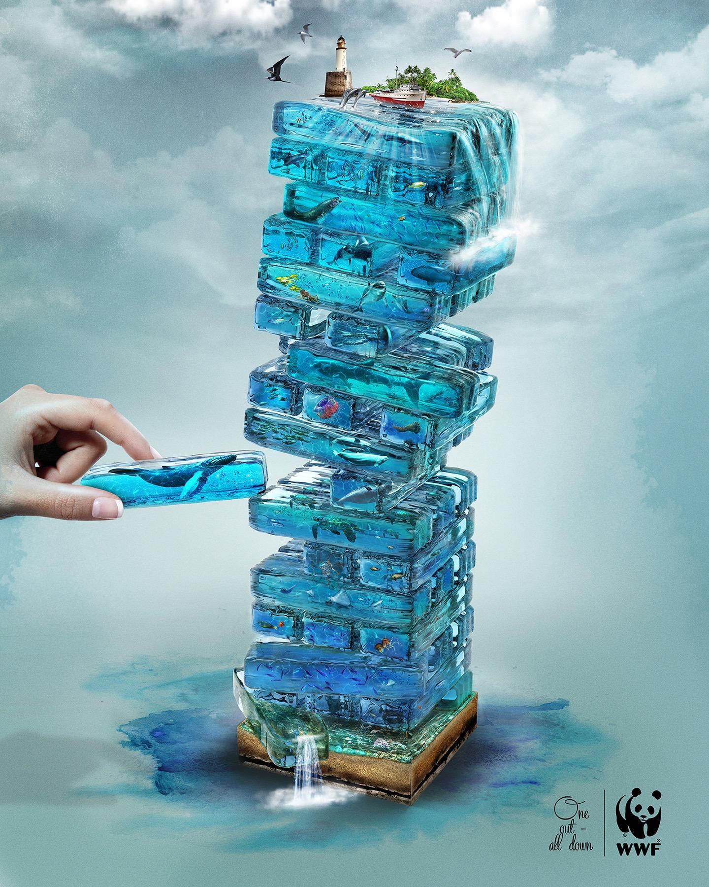
It’s easy to visually link this image to the game, Jenga; recalling the intense anticipatory feeling as you pull out a questionable piece, just to watch the whole structure crumble. The understanding and emotional connection are immediate, and they’re followed by beautiful renderings that could keep the viewer finding new details within the pieces for far too long. WWF wouldn’t have needed to include “One out – all down” for the viewer to understand this powerful message in this two-piece ad campaign.
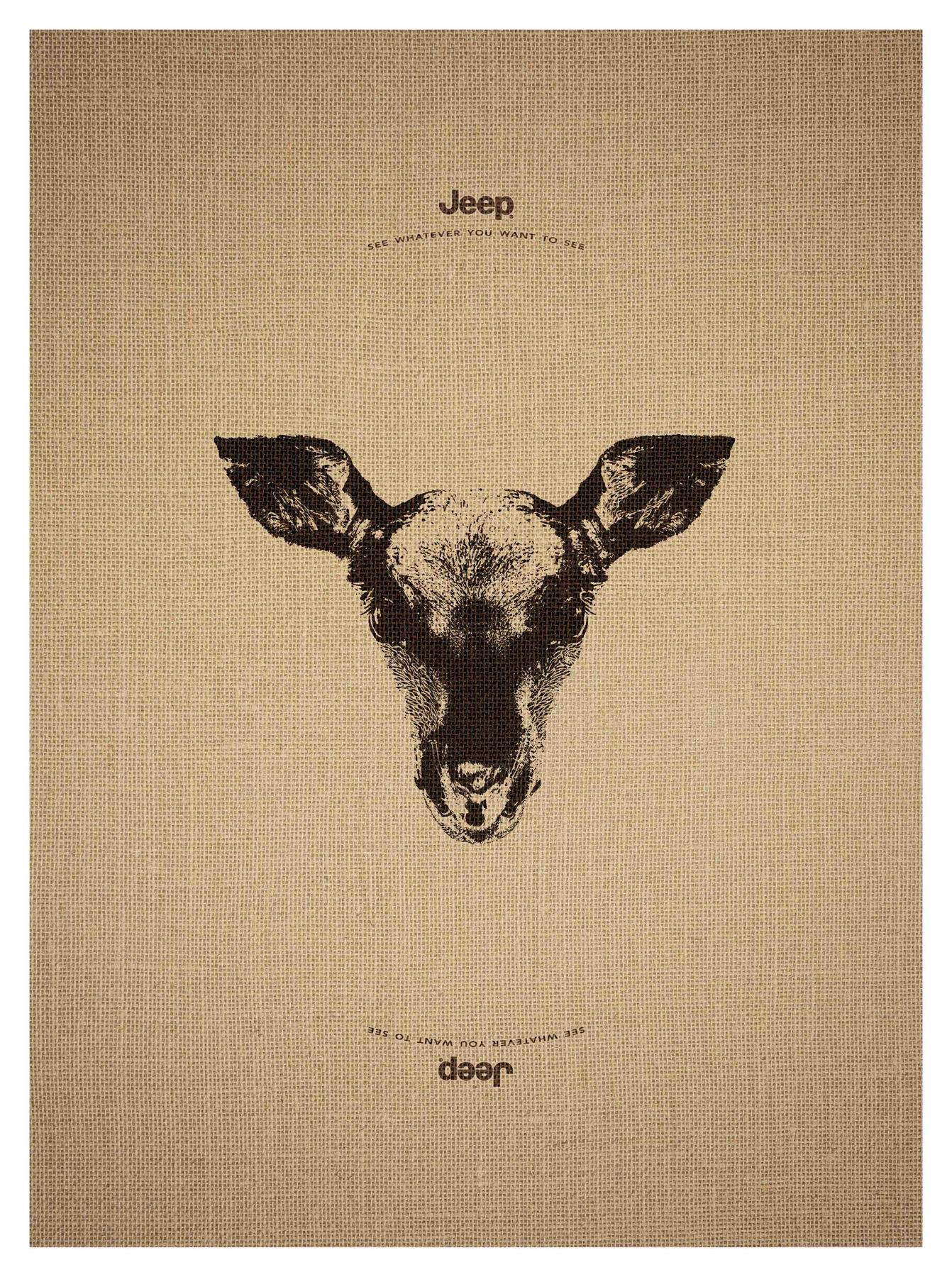
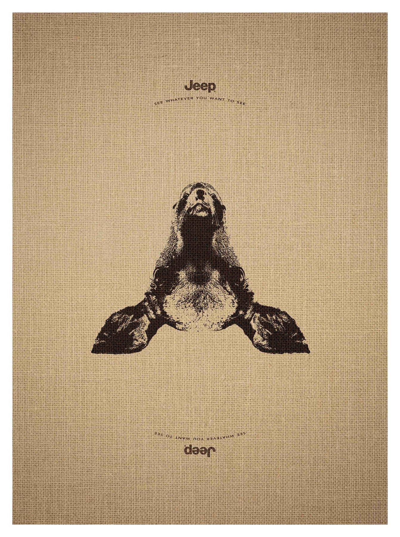
Once you realize the lower text is upside down, it’s only natural to turn the ad (or try to turn yourself) to read it. Once flipped, seeing the clever second image within the first lends to feelings of adventure and empowerment via various animals from different areas of the world and an individual’s ability to choose their own experience. This level of witty illustration is brilliant in all three of this campaign’s pieces.
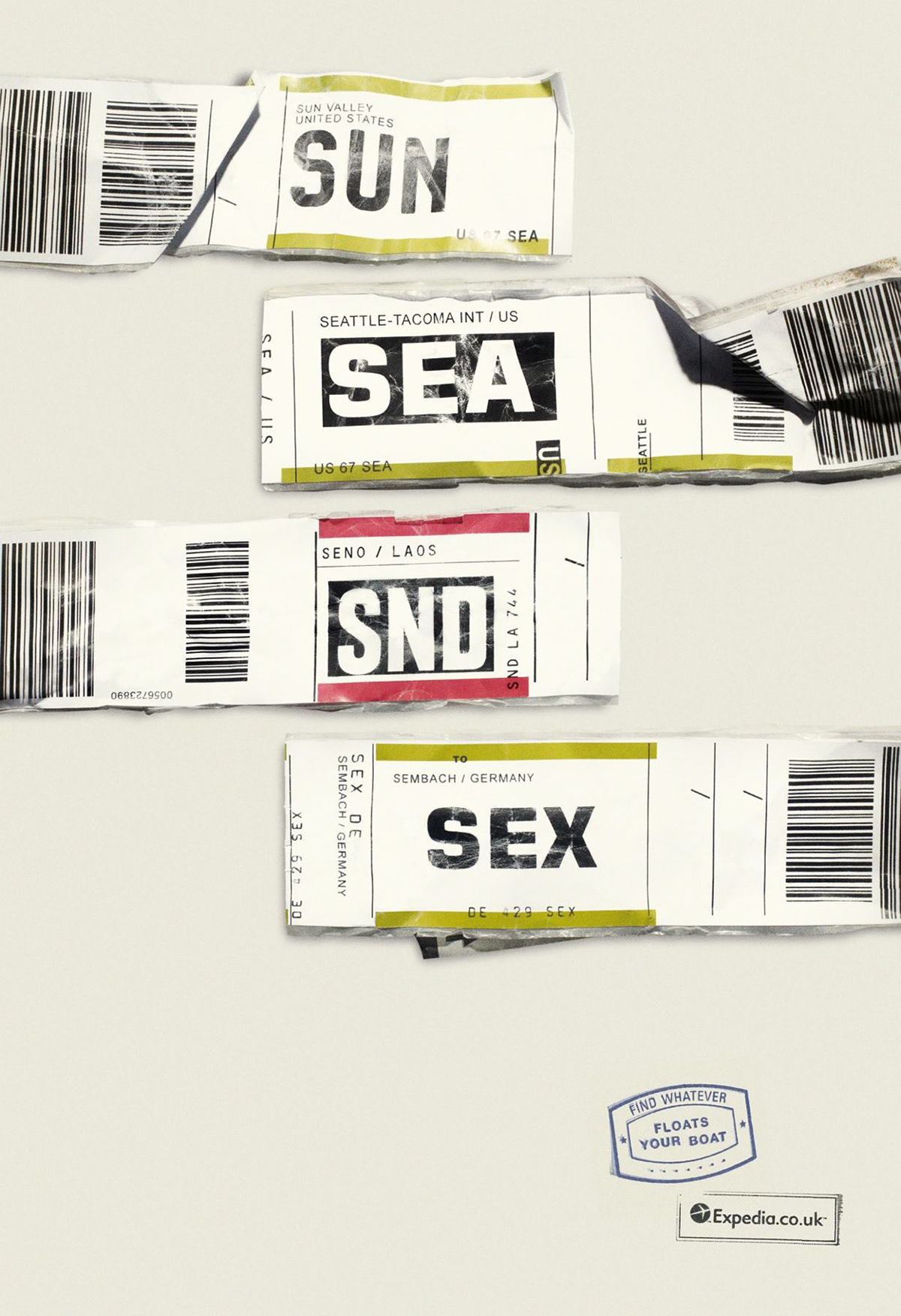
The mental link to traveling by means of air is obvious to those who’ve acquired similar tags on luggage (shout out my current home base, Sea-Tac, in this ad). There are nine total ads in this series for Expedia UK; where puns of the global airport IATA codes on luggage tags paired with passport stamp punchlines were used in a delightfully fun style, and do a great job of drawing in curious viewers, potentially from all over the world.
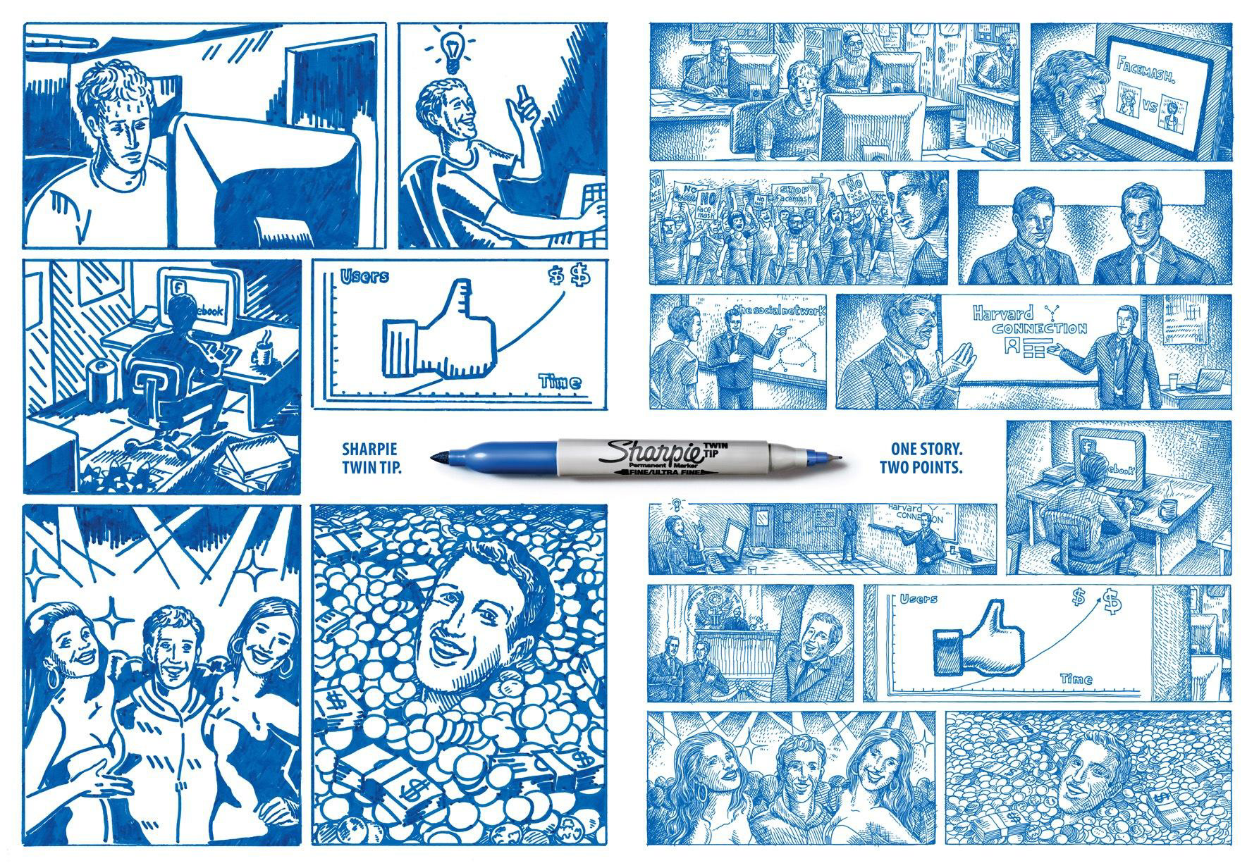
The great textural contrast portrayed alongside the visual of a dual-tipped Sharpie does all the talking in all three ads of this series. To make this campaign even less copy-reliant, the text on the Sharpie itself could migrate to be a bit more obvious and legible, while the whole Sharpie itself could enlarge, if desired, making the text on either side of the tool obsolete.
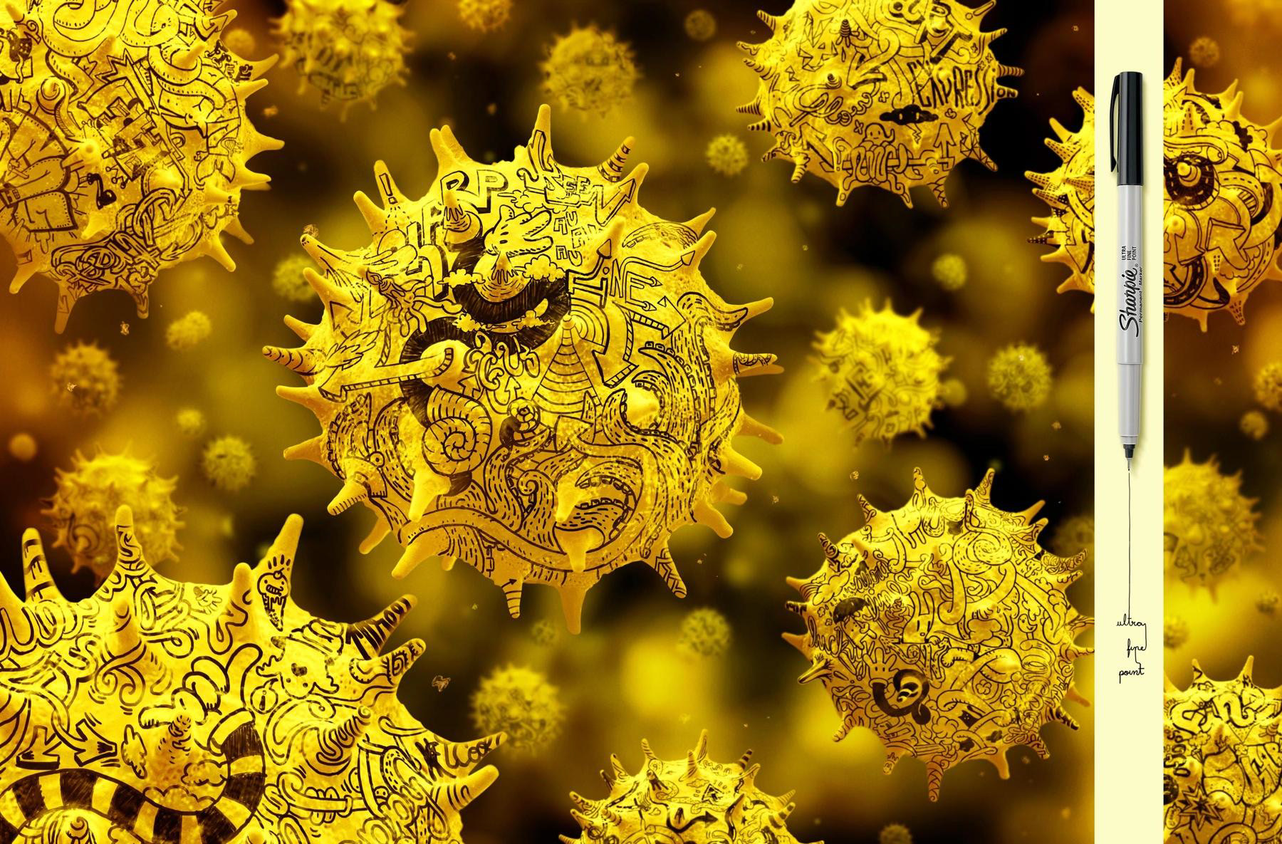
Another for Sharpie with this dramatization of what an ultra-fine tipped Sharpie can accomplish; visually displaying microscopic detail ability on cells of some kind, presumably under a microscope (obviously not science-minded here). One of a three series campaign, the message is clear without any text added to explain, and the product specifics could be clear without the present copy if the Sharpie was rotated 90 degrees clockwise and enlarged a bit for readability, if necessary. The concept and illustrative delivery of this campaign overall was witty, bright, and well-executed.
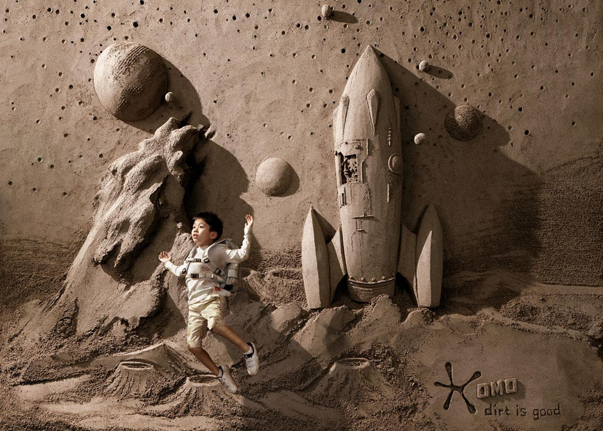
This ad is the ultimate encouragement for letting children play and get gunky without hindering any fun by worrying about germs and aftermath. OMO comforts the viewer that all will be well and dirt is good, because there are tools to handle it. All three advertisements in this campaign show how dirt can enable positive imagination and exploration, portray dirt as something that is fun and optimistic, and all have a surprising amount of visual depth and detail.
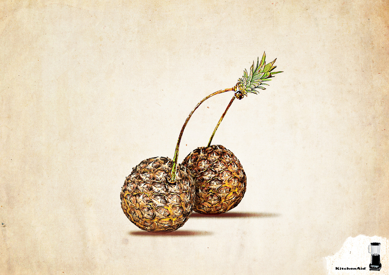
My first thought when seeing this at thumbnail size was, “WHAT is that weird fruit?!” Curiosity sucked me in and of course it became clear the moment I took a true-sized look and saw the image of the blender in the lower-right corner. Fruit smoothies are delicious and popular. Creating a visual that literally combines two well-known and yummy fruits is a perfectly clever way to inspire a craving, along with an easy-blending at-home solution, and it’s done in a wonderfully playful, illustrative way – almost dreamy.
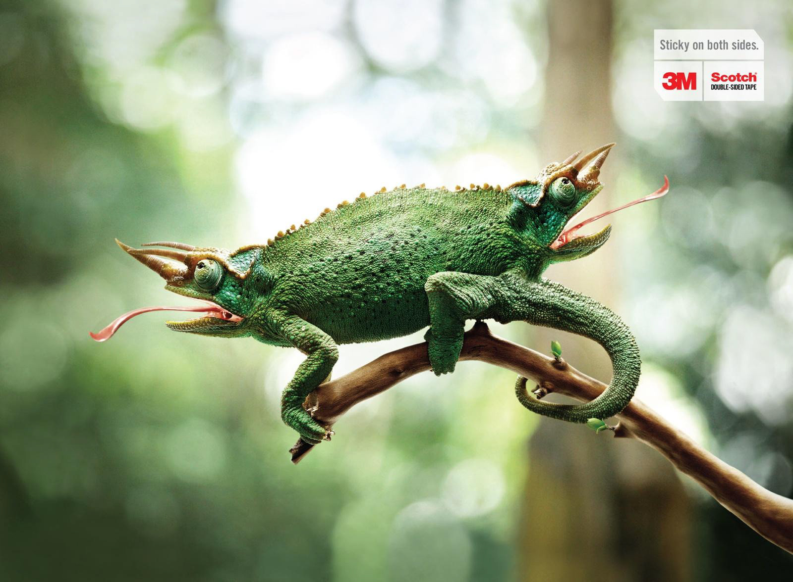
The text, “Sticky on both sides,” isn’t necessary here to understand that 3M’s double-sided tape is efficiently sticky on both sides, but the visualization of the phrase is hilarious; likening a two-headed, double-ended chameleon to the product. The shocking appearance of the mutated chameleon (the partner ad in the same campaign is a frog), along with the contrast of its skin texture against the smooth backdrop, makes for stunning eye-candy to draw the viewer in.
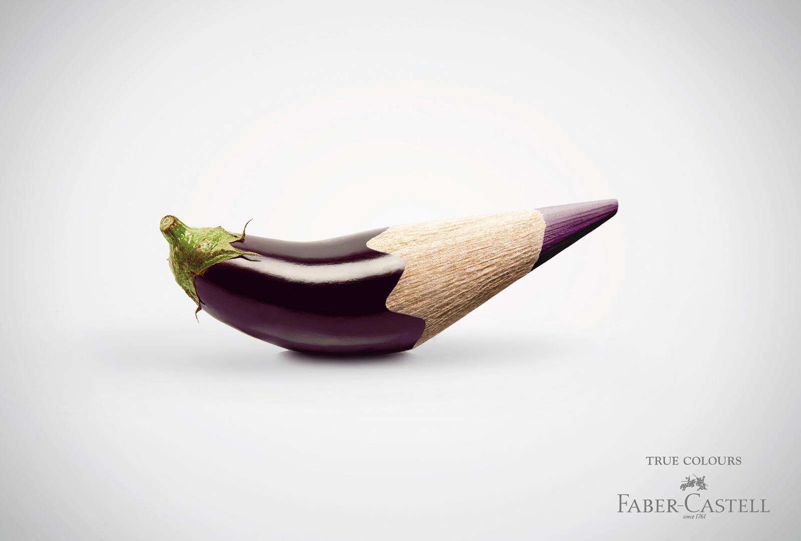
By simply showcasing that Faber-Castell colored pencils capture the true essence of a color, this advertisement does its job with an eccentric and striking fusing of subject and pencil. The campaign series includes four total renditions, although there are countless possibilities for more with the same facetious concept.
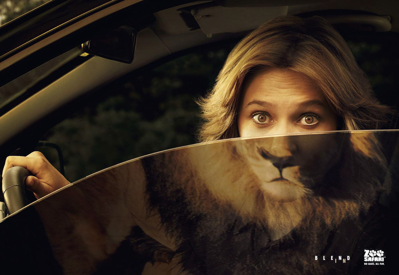
This ad clearly says, “front row experience,” and uses brilliant visual analogies between humans and safari animals to stand out, ironically, for Zoo Safari’s “blend in” three series campaign. In this example, the blonde hair and lion’s mane relate and blend fluently; pairing that, along with the expression in the woman’s eyes, creates a sensational sight.
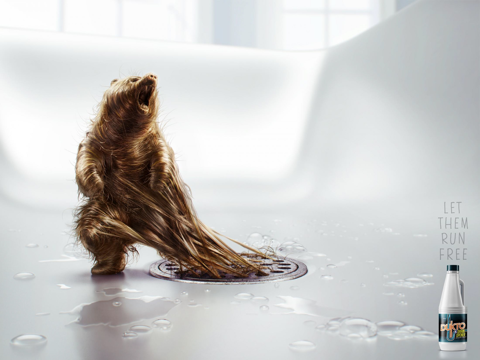
This ad does an amazing job of portraying something disgusting as fascinating; a challenging accomplishment. A ferocious hair-bear trapped in a drain illustrates the need for Dukto Drain Opener to allow your hair-animals to run free. One of two in the campaign (the other being an elephant), this detailed rendering of a bear made of drain hair turns a very gross factor into something almost impossible not to take a second look to inspect the illustrative qualities.
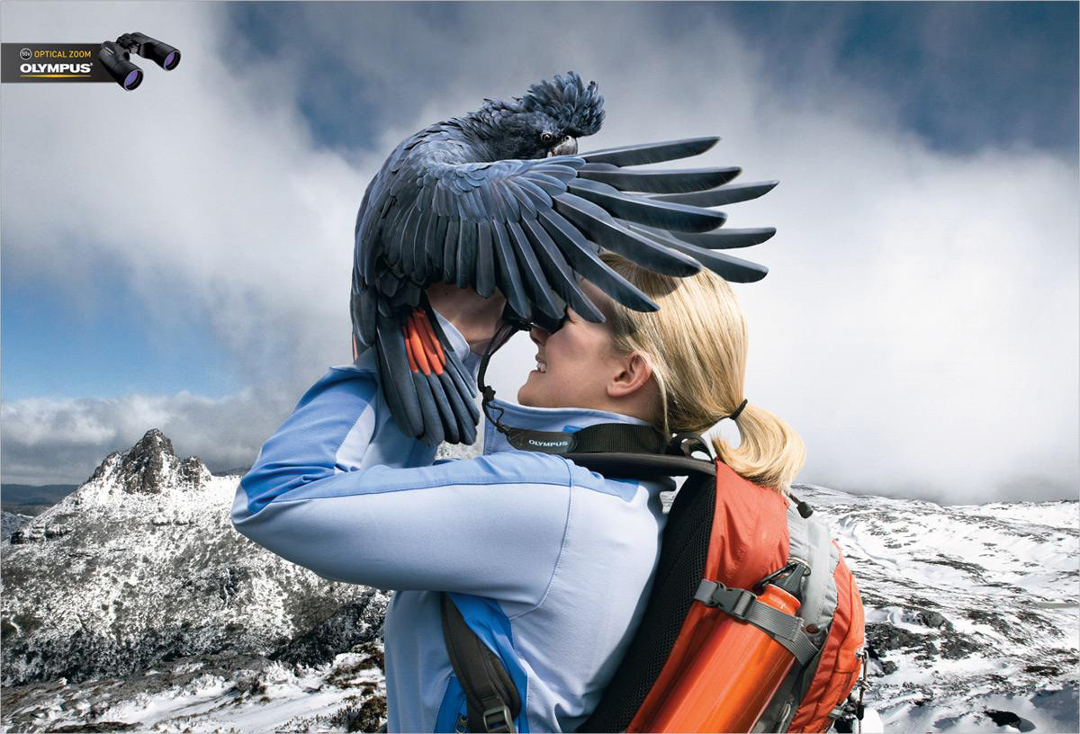
An impressive visual of the word, “zoom,” gives a new meaning to “close-up”. One in a three-piece campaign, this ad beautifully displays a solution to the desire to get up-close and personal to animals by using Olympus binoculars in a hilariously literal and brilliantly photorealistic way.
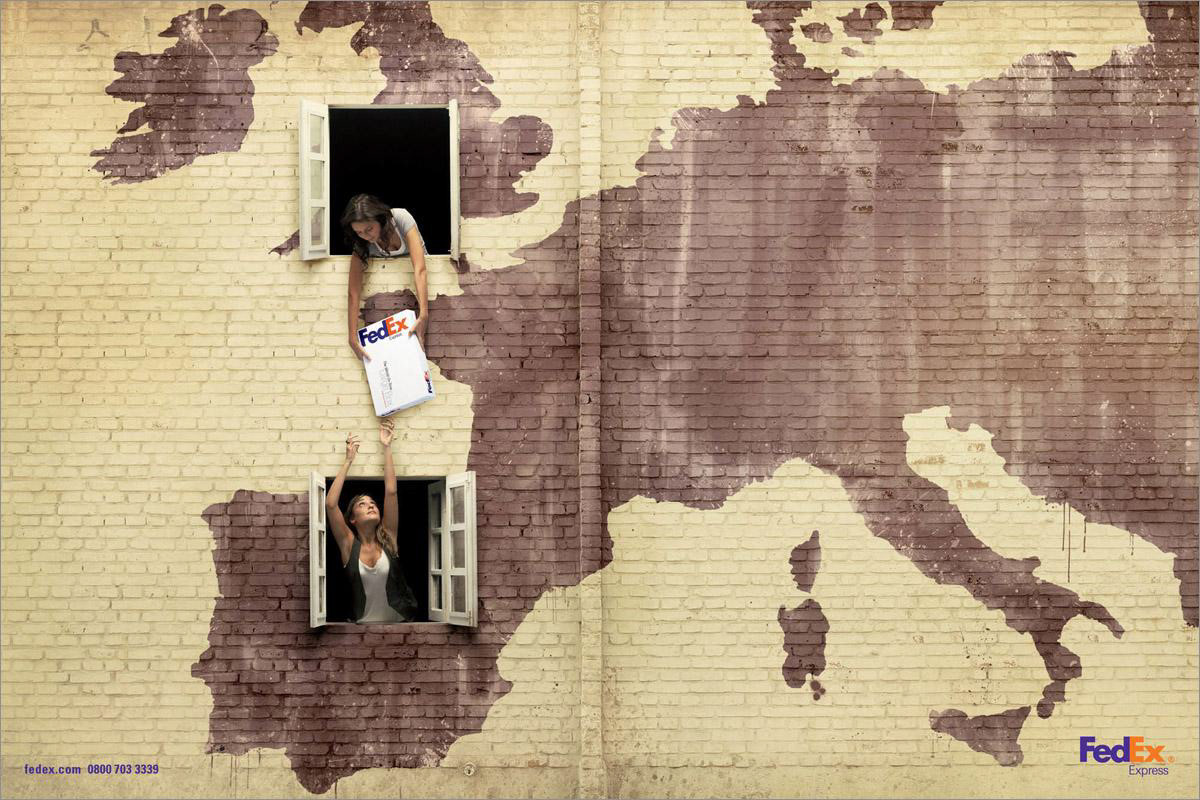
The message is so simple in this three-ad campaign; sending packages from one country to another is quick and simple using FedEx. They liken the process to being neighbors and just having to stretch a bit to hand the package off. The innuendo is effortless and simply done, yet still visually appealing; playing with the idea of sharing country-to-country amongst fun wall textures and window hand-offs.
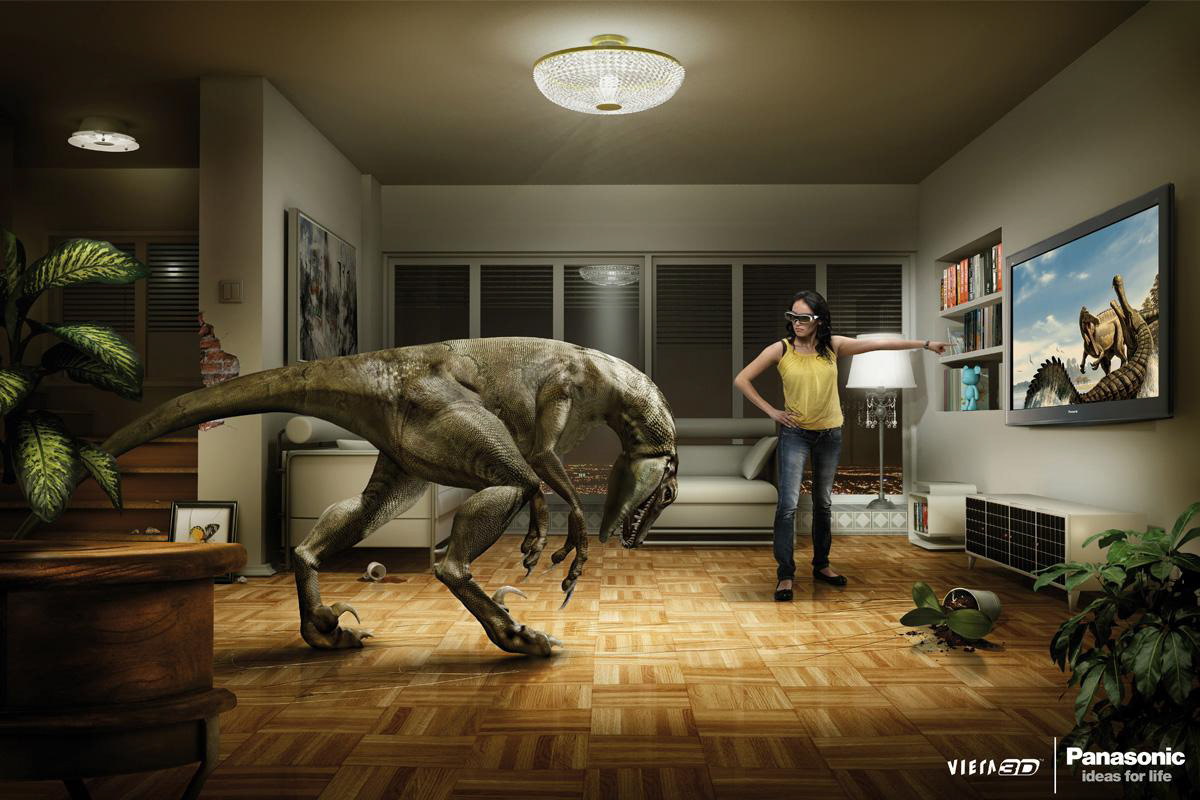
This amusing presentation of 3D movie characters becoming so real that they hop into the living room is wonderful, but this campaign tops off the humor by showing TV viewers scolding the characters to get back in their screen. It’s an entertaining way to portray fun, adventure, and 3D; and Panasonic manages it in a great, detailed photorealistic manner for both the ads in this two-piece campaign.
Lego will always have a special place in my memories, but that bias doesn’t take away from the brilliant concept and simple delivery of this campaign. One of three, this advertisement is crystal clear, yet subtle, in saying “Imagination.” A timeless solution that is extremely minimal and still speaks so loudly, is hard to generate, but this campaign succeeded.
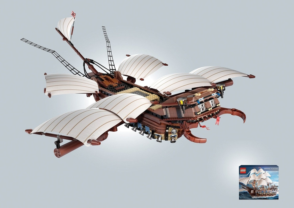
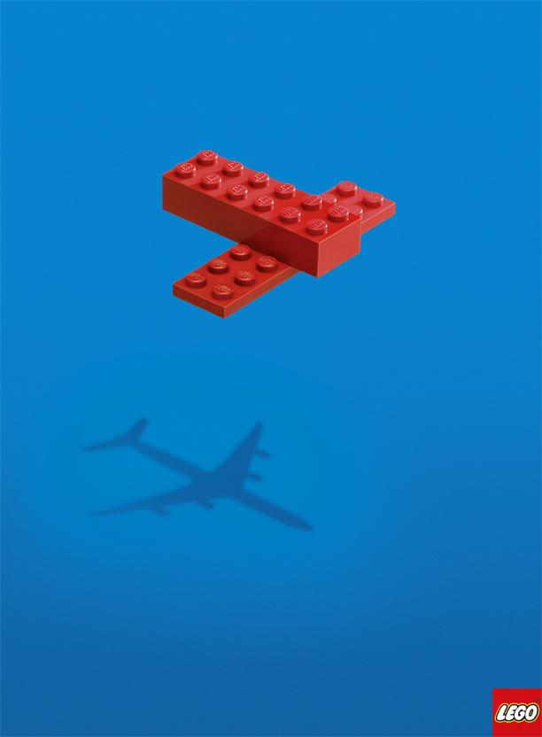
A second Lego campaign that says, “Imagination,” but with an added flare of, “Endless Possibilities,” and all without one word of copy. One of a three-piece campaign, this piece demonstrates two of the many capabilities of a boxed Lego set; one of the actual product display and the other showcased larger in a different variation possibility, both clear, and with an amazing amount of detail.
Conclusion
Attention has become a scarce commodity in our information saturated marketplace. Consumers are bombarded with messages from all directions, making it even more critical to stand out from the competition. Sales and profits depend on consumer perceptions, loyalty, emotional connection, and their identification with your product or service. When consumers have a strong emotional tie to your product or service, that tie will increase the value of your brand and boost your profits — even in such a competitive market. This edition of Creative Juice showcased a few great examples of one strategic method to achieving that emotional breakthrough, therefore soliciting brand recognition, but there are so many more.
An essential part of strategic branding is continually reinforcing a brand’s foundation and ability to respond favorably to a fluctuating marketplace. These brand platforms influence consumer perceptions and illicit brand reinforcement, which consistently inspires brand loyalty and creates company success.